Habitat Nieuws april 2021
Een steentje bijdragen met belastingvoordeel?
Als je je donatie aan Habitat voor 5 jaar vastlegt, dan betaalt de fiscus mee! En wist je dat wij in Roemenië een alarmcentrale hebben gebouwd, zodat hulpverleners goed uitgerust hun belangrijke werk kunnen doen? Of dat wij vorig jaar, ondanks alle maatregelen, elke maand 2.000 mensen hebben kunnen helpen een beter leven op te bouwen? Je leest er meer over in deze Habitat Nieuws.
Op de hoogte blijven?
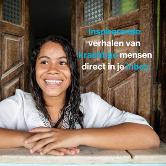
Wil je in de toekomst onze nieuwsbrief ontvangen? Meld je hier aan en ontvang de volgende Habitat Nieuws in je mailbox!
96
*|MC:SUBJECT|*
p{
margin:10px 0;
padding:0;
}
table{
border-collapse:collapse;
}
h1,h2,h3,h4,h5,h6{
display:block;
margin:0;
padding:0;
}
img,a img{
border:0;
height:auto;
outline:none;
text-decoration:none;
}
body,#bodyTable,#bodyCell{
height:100%;
margin:0;
padding:0;
width:100%;
}
.mcnPreviewText{
display:none !important;
}
#outlook a{
padding:0;
}
img{
-ms-interpolation-mode:bicubic;
}
table{
mso-table-lspace:0pt;
mso-table-rspace:0pt;
}
.ReadMsgBody{
width:100%;
}
.ExternalClass{
width:100%;
}
p,a,li,td,blockquote{
mso-line-height-rule:exactly;
}
a[href^=tel],a[href^=sms]{
color:inherit;
cursor:default;
text-decoration:none;
}
p,a,li,td,body,table,blockquote{
-ms-text-size-adjust:100%;
-webkit-text-size-adjust:100%;
}
.ExternalClass,.ExternalClass p,.ExternalClass td,.ExternalClass div,.ExternalClass span,.ExternalClass font{
line-height:100%;
}
a[x-apple-data-detectors]{
color:inherit !important;
text-decoration:none !important;
font-size:inherit !important;
font-family:inherit !important;
font-weight:inherit !important;
line-height:inherit !important;
}
.templateContainer{
max-width:600px !important;
}
a.mcnButton{
display:block;
}
.mcnImage,.mcnRetinaImage{
vertical-align:bottom;
}
.mcnTextContent{
word-break:break-word;
}
.mcnTextContent img{
height:auto !important;
}
.mcnDividerBlock{
table-layout:fixed !important;
}
h1{
color:#222222;
font-family:Helvetica;
font-size:40px;
font-style:normal;
font-weight:bold;
line-height:150%;
letter-spacing:normal;
text-align:center;
}
h2{
color:#222222;
font-family:Helvetica;
font-size:34px;
font-style:normal;
font-weight:bold;
line-height:150%;
letter-spacing:normal;
text-align:left;
}
h3{
color:#444444;
font-family:Helvetica;
font-size:22px;
font-style:normal;
font-weight:bold;
line-height:150%;
letter-spacing:normal;
text-align:left;
}
h4{
color:#949494;
font-family:Georgia;
font-size:20px;
font-style:italic;
font-weight:normal;
line-height:125%;
letter-spacing:normal;
text-align:left;
}
#templateHeader{
background-color:#4caad8;
background-image:none;
background-repeat:no-repeat;
background-position:50% 50%;
background-size:cover;
border-top:0;
border-bottom:0;
padding-top:0px;
padding-bottom:0px;
}
.headerContainer{
background-color:transparent;
background-image:none;
background-repeat:no-repeat;
background-position:center;
background-size:cover;
border-top:0;
border-bottom:0;
padding-top:0;
padding-bottom:0;
}
.headerContainer .mcnTextContent,.headerContainer .mcnTextContent p{
color:#757575;
font-family:Helvetica;
font-size:16px;
line-height:150%;
text-align:left;
}
.headerContainer .mcnTextContent a,.headerContainer .mcnTextContent p a{
color:#007C89;
font-weight:normal;
text-decoration:underline;
}
#templateBody{
background-color:#transparent;
background-image:none;
background-repeat:no-repeat;
background-position:center;
background-size:cover;
border-top:0;
border-bottom:0;
padding-top:27px;
padding-bottom:54px;
}
.bodyContainer{
background-color:transparent;
background-image:none;
background-repeat:no-repeat;
background-position:center;
background-size:cover;
border-top:0;
border-bottom:0;
padding-top:0;
padding-bottom:0;
}
.bodyContainer .mcnTextContent,.bodyContainer .mcnTextContent p{
color:#757575;
font-family:Helvetica;
font-size:16px;
line-height:150%;
text-align:left;
}
.bodyContainer .mcnTextContent a,.bodyContainer .mcnTextContent p a{
color:#007C89;
font-weight:normal;
text-decoration:underline;
}
#templateFooter{
background-color:#00afd7;
background-image:none;
background-repeat:no-repeat;
background-position:center;
background-size:cover;
border-top:0;
border-bottom:0;
padding-top:0px;
padding-bottom:0px;
}
.footerContainer{
background-color:#transparent;
background-image:none;
background-repeat:no-repeat;
background-position:center;
background-size:cover;
border-top:0;
border-bottom:0;
padding-top:0;
padding-bottom:0;
}
.footerContainer .mcnTextContent,.footerContainer .mcnTextContent p{
color:#FFFFFF;
font-family:Helvetica;
font-size:12px;
line-height:150%;
text-align:center;
}
.footerContainer .mcnTextContent a,.footerContainer .mcnTextContent p a{
color:#FFFFFF;
font-weight:normal;
text-decoration:underline;
}
@media only screen and (min-width:768px){
.templateContainer{
width:600px !important;
}
} @media only screen and (max-width: 480px){
body,table,td,p,a,li,blockquote{
-webkit-text-size-adjust:none !important;
}
} @media only screen and (max-width: 480px){
body{
width:100% !important;
min-width:100% !important;
}
} @media only screen and (max-width: 480px){
.mcnRetinaImage{
max-width:100% !important;
}
} @media only screen and (max-width: 480px){
.mcnImage{
width:100% !important;
}
} @media only screen and (max-width: 480px){
.mcnCartContainer,.mcnCaptionTopContent,.mcnRecContentContainer,.mcnCaptionBottomContent,.mcnTextContentContainer,.mcnBoxedTextContentContainer,.mcnImageGroupContentContainer,.mcnCaptionLeftTextContentContainer,.mcnCaptionRightTextContentContainer,.mcnCaptionLeftImageContentContainer,.mcnCaptionRightImageContentContainer,.mcnImageCardLeftTextContentContainer,.mcnImageCardRightTextContentContainer,.mcnImageCardLeftImageContentContainer,.mcnImageCardRightImageContentContainer{
max-width:100% !important;
width:100% !important;
}
} @media only screen and (max-width: 480px){
.mcnBoxedTextContentContainer{
min-width:100% !important;
}
} @media only screen and (max-width: 480px){
.mcnImageGroupContent{
padding:9px !important;
}
} @media only screen and (max-width: 480px){
.mcnCaptionLeftContentOuter .mcnTextContent,.mcnCaptionRightContentOuter .mcnTextContent{
padding-top:9px !important;
}
} @media only screen and (max-width: 480px){
.mcnImageCardTopImageContent,.mcnCaptionBottomContent:last-child .mcnCaptionBottomImageContent,.mcnCaptionBlockInner .mcnCaptionTopContent:last-child .mcnTextContent{
padding-top:18px !important;
}
} @media only screen and (max-width: 480px){
.mcnImageCardBottomImageContent{
padding-bottom:9px !important;
}
} @media only screen and (max-width: 480px){
.mcnImageGroupBlockInner{
padding-top:0 !important;
padding-bottom:0 !important;
}
} @media only screen and (max-width: 480px){
.mcnImageGroupBlockOuter{
padding-top:9px !important;
padding-bottom:9px !important;
}
} @media only screen and (max-width: 480px){
.mcnTextContent,.mcnBoxedTextContentColumn{
padding-right:18px !important;
padding-left:18px !important;
}
} @media only screen and (max-width: 480px){
.mcnImageCardLeftImageContent,.mcnImageCardRightImageContent{
padding-right:18px !important;
padding-bottom:0 !important;
padding-left:18px !important;
}
} @media only screen and (max-width: 480px){
.mcpreview-image-uploader{
display:none !important;
width:100% !important;
}
} @media only screen and (max-width: 480px){
h1{
font-size:30px !important;
line-height:125% !important;
}
} @media only screen and (max-width: 480px){
h2{
font-size:26px !important;
line-height:125% !important;
}
} @media only screen and (max-width: 480px){
h3{
font-size:20px !important;
line-height:150% !important;
}
} @media only screen and (max-width: 480px){
h4{
font-size:18px !important;
line-height:150% !important;
}
} @media only screen and (max-width: 480px){
.mcnBoxedTextContentContainer .mcnTextContent,.mcnBoxedTextContentContainer .mcnTextContent p{
font-size:14px !important;
line-height:150% !important;
}
} @media only screen and (max-width: 480px){
.headerContainer .mcnTextContent,.headerContainer .mcnTextContent p{
font-size:16px !important;
line-height:150% !important;
}
} @media only screen and (max-width: 480px){
.bodyContainer .mcnTextContent,.bodyContainer .mcnTextContent p{
font-size:16px !important;
line-height:150% !important;
}
} @media only screen and (max-width: 480px){
.footerContainer .mcnTextContent,.footerContainer .mcnTextContent p{
font-size:14px !important;
line-height:150% !important;
}
}
*|MC_PREVIEW_TEXT|*<!--
|