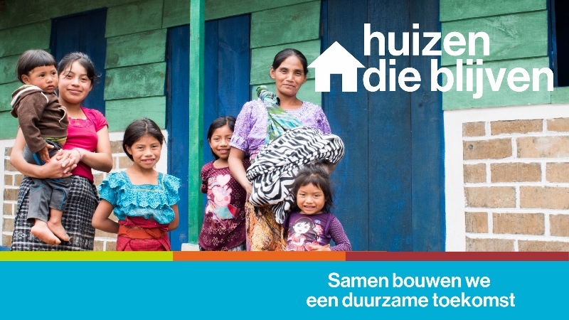
Wereldwijd leven 1,6 miljard mensen in onveilige onderkomens. Hutjes met lekkende daken en rottende of instabiele muren. Zonder ramen of een deur die op slot kan. Onveilig en ronduit ongezond.
Habitat bouwt huizen die blijven. Een Habitathuis blijft staan in een storm en stort niet in bij een overstroming. Zo’n huis is toekomstbestendig en kan de gevolgen van klimaatverandering aan. Het staat niet alleen op naam van de man in het gezin, ook de vrouw krijgt eigendomsrecht. Zodat – wat er ook gebeurt – de familie en de volgende generaties er kunnen blijven wonen. Zo zijn ze veilig en kunnen zelfstandig verder bouwen aan een duurzame toekomst.
Met een donatie aan Habitat bouw jij mee aan zo’n duurzame toekomst >>
96
*|MC:SUBJECT|*
p{
margin:10px 0;
padding:0;
}
table{
border-collapse:collapse;
}
h1,h2,h3,h4,h5,h6{
display:block;
margin:0;
padding:0;
}
img,a img{
border:0;
height:auto;
outline:none;
text-decoration:none;
}
body,#bodyTable,#bodyCell{
height:100%;
margin:0;
padding:0;
width:100%;
}
.mcnPreviewText{
display:none !important;
}
#outlook a{
padding:0;
}
img{
-ms-interpolation-mode:bicubic;
}
table{
mso-table-lspace:0pt;
mso-table-rspace:0pt;
}
.ReadMsgBody{
width:100%;
}
.ExternalClass{
width:100%;
}
p,a,li,td,blockquote{
mso-line-height-rule:exactly;
}
a[href^=tel],a[href^=sms]{
color:inherit;
cursor:default;
text-decoration:none;
}
p,a,li,td,body,table,blockquote{
-ms-text-size-adjust:100%;
-webkit-text-size-adjust:100%;
}
.ExternalClass,.ExternalClass p,.ExternalClass td,.ExternalClass div,.ExternalClass span,.ExternalClass font{
line-height:100%;
}
a[x-apple-data-detectors]{
color:inherit !important;
text-decoration:none !important;
font-size:inherit !important;
font-family:inherit !important;
font-weight:inherit !important;
line-height:inherit !important;
}
.templateContainer{
max-width:600px !important;
}
a.mcnButton{
display:block;
}
.mcnImage,.mcnRetinaImage{
vertical-align:bottom;
}
.mcnTextContent{
word-break:break-word;
}
.mcnTextContent img{
height:auto !important;
}
.mcnDividerBlock{
table-layout:fixed !important;
}
h1{
color:#222222;
font-family:Helvetica;
font-size:40px;
font-style:normal;
font-weight:bold;
line-height:150%;
letter-spacing:normal;
text-align:center;
}
h2{
color:#222222;
font-family:Helvetica;
font-size:34px;
font-style:normal;
font-weight:bold;
line-height:150%;
letter-spacing:normal;
text-align:left;
}
h3{
color:#444444;
font-family:Helvetica;
font-size:22px;
font-style:normal;
font-weight:bold;
line-height:150%;
letter-spacing:normal;
text-align:left;
}
h4{
color:#949494;
font-family:Georgia;
font-size:20px;
font-style:italic;
font-weight:normal;
line-height:125%;
letter-spacing:normal;
text-align:left;
}
#templateHeader{
background-color:#4caad8;
background-image:none;
background-repeat:no-repeat;
background-position:50% 50%;
background-size:cover;
border-top:0;
border-bottom:0;
padding-top:0px;
padding-bottom:0px;
}
.headerContainer{
background-color:transparent;
background-image:none;
background-repeat:no-repeat;
background-position:center;
background-size:cover;
border-top:0;
border-bottom:0;
padding-top:0;
padding-bottom:0;
}
.headerContainer .mcnTextContent,.headerContainer .mcnTextContent p{
color:#757575;
font-family:Helvetica;
font-size:16px;
line-height:150%;
text-align:left;
}
.headerContainer .mcnTextContent a,.headerContainer .mcnTextContent p a{
color:#007C89;
font-weight:normal;
text-decoration:underline;
}
#templateBody{
background-color:#transparent;
background-image:none;
background-repeat:no-repeat;
background-position:center;
background-size:cover;
border-top:0;
border-bottom:0;
padding-top:27px;
padding-bottom:54px;
}
.bodyContainer{
background-color:transparent;
background-image:none;
background-repeat:no-repeat;
background-position:center;
background-size:cover;
border-top:0;
border-bottom:0;
padding-top:0;
padding-bottom:0;
}
.bodyContainer .mcnTextContent,.bodyContainer .mcnTextContent p{
color:#757575;
font-family:Helvetica;
font-size:16px;
line-height:150%;
text-align:left;
}
.bodyContainer .mcnTextContent a,.bodyContainer .mcnTextContent p a{
color:#007C89;
font-weight:normal;
text-decoration:underline;
}
#templateFooter{
background-color:#00afd7;
background-image:none;
background-repeat:no-repeat;
background-position:center;
background-size:cover;
border-top:0;
border-bottom:0;
padding-top:0px;
padding-bottom:0px;
}
.footerContainer{
background-color:#transparent;
background-image:none;
background-repeat:no-repeat;
background-position:center;
background-size:cover;
border-top:0;
border-bottom:0;
padding-top:0;
padding-bottom:0;
}
.footerContainer .mcnTextContent,.footerContainer .mcnTextContent p{
color:#FFFFFF;
font-family:Helvetica;
font-size:12px;
line-height:150%;
text-align:center;
}
.footerContainer .mcnTextContent a,.footerContainer .mcnTextContent p a{
color:#FFFFFF;
font-weight:normal;
text-decoration:underline;
}
@media only screen and (min-width:768px){
.templateContainer{
width:600px !important;
}
} @media only screen and (max-width: 480px){
body,table,td,p,a,li,blockquote{
-webkit-text-size-adjust:none !important;
}
} @media only screen and (max-width: 480px){
body{
width:100% !important;
min-width:100% !important;
}
} @media only screen and (max-width: 480px){
.mcnRetinaImage{
max-width:100% !important;
}
} @media only screen and (max-width: 480px){
.mcnImage{
width:100% !important;
}
} @media only screen and (max-width: 480px){
.mcnCartContainer,.mcnCaptionTopContent,.mcnRecContentContainer,.mcnCaptionBottomContent,.mcnTextContentContainer,.mcnBoxedTextContentContainer,.mcnImageGroupContentContainer,.mcnCaptionLeftTextContentContainer,.mcnCaptionRightTextContentContainer,.mcnCaptionLeftImageContentContainer,.mcnCaptionRightImageContentContainer,.mcnImageCardLeftTextContentContainer,.mcnImageCardRightTextContentContainer,.mcnImageCardLeftImageContentContainer,.mcnImageCardRightImageContentContainer{
max-width:100% !important;
width:100% !important;
}
} @media only screen and (max-width: 480px){
.mcnBoxedTextContentContainer{
min-width:100% !important;
}
} @media only screen and (max-width: 480px){
.mcnImageGroupContent{
padding:9px !important;
}
} @media only screen and (max-width: 480px){
.mcnCaptionLeftContentOuter .mcnTextContent,.mcnCaptionRightContentOuter .mcnTextContent{
padding-top:9px !important;
}
} @media only screen and (max-width: 480px){
.mcnImageCardTopImageContent,.mcnCaptionBottomContent:last-child .mcnCaptionBottomImageContent,.mcnCaptionBlockInner .mcnCaptionTopContent:last-child .mcnTextContent{
padding-top:18px !important;
}
} @media only screen and (max-width: 480px){
.mcnImageCardBottomImageContent{
padding-bottom:9px !important;
}
} @media only screen and (max-width: 480px){
.mcnImageGroupBlockInner{
padding-top:0 !important;
padding-bottom:0 !important;
}
} @media only screen and (max-width: 480px){
.mcnImageGroupBlockOuter{
padding-top:9px !important;
padding-bottom:9px !important;
}
} @media only screen and (max-width: 480px){
.mcnTextContent,.mcnBoxedTextContentColumn{
padding-right:18px !important;
padding-left:18px !important;
}
} @media only screen and (max-width: 480px){
.mcnImageCardLeftImageContent,.mcnImageCardRightImageContent{
padding-right:18px !important;
padding-bottom:0 !important;
padding-left:18px !important;
}
} @media only screen and (max-width: 480px){
.mcpreview-image-uploader{
display:none !important;
width:100% !important;
}
} @media only screen and (max-width: 480px){
h1{
font-size:30px !important;
line-height:125% !important;
}
} @media only screen and (max-width: 480px){
h2{
font-size:26px !important;
line-height:125% !important;
}
} @media only screen and (max-width: 480px){
h3{
font-size:20px !important;
line-height:150% !important;
}
} @media only screen and (max-width: 480px){
h4{
font-size:18px !important;
line-height:150% !important;
}
} @media only screen and (max-width: 480px){
.mcnBoxedTextContentContainer .mcnTextContent,.mcnBoxedTextContentContainer .mcnTextContent p{
font-size:14px !important;
line-height:150% !important;
}
} @media only screen and (max-width: 480px){
.headerContainer .mcnTextContent,.headerContainer .mcnTextContent p{
font-size:16px !important;
line-height:150% !important;
}
} @media only screen and (max-width: 480px){
.bodyContainer .mcnTextContent,.bodyContainer .mcnTextContent p{
font-size:16px !important;
line-height:150% !important;
}
} @media only screen and (max-width: 480px){
.footerContainer .mcnTextContent,.footerContainer .mcnTextContent p{
font-size:14px !important;
line-height:150% !important;
}
}
*|MC_PREVIEW_TEXT|*<!--
Habitat bouwt aan een duurzame toekomst - met huizen die blijven
Stel je voor: je woont in een zelfgemaakt hutje van golfplaat en zeil. Zo’n huis kan elk moment instorten, zeker met het regenseizoen op komst. Een duurzame toekomst is dan ver weg. Elke dag is dan simpelweg overleven en hopen dat je de volgende dag nog onderdak hebt voor je gezin.
Daarom bouwt Habitat huizen die blijven. Maar wat bedoelen we daarmee?
- Een Habitathuis blijft staan - ook bij regen, storm of aardbevingen. Zo’n huis is toekomstbestendig en kan de gevolgen van klimaatverandering aan.
- Een Habitathuis is voor het hele gezin. Niet alleen de man, maar ook de vrouw krijgt eigendomsrecht, zodat zij én de volgende generaties er altijd veilig kunnen blijven wonen.
Op die manier is een Habitathuis écht een veilige basis van waaruit de bewoners zelf kunnen bouwen aan een duurzame toekomst.
Met een donatie aan Habitat bouw jij mee aan zo’n duurzame toekomst.
|
|
|
Ramppreventie: voorkomen is 6 x keer beter dan genezen
#Wistjedat elke euro die wordt geïnvesteerd in het voorkomen van de gevolgen van een ramp, zes euro bespaart aan noodhulp en wederopbouw na een ramp?
Bij Habitat begint rampenbestrijding al ver vóór een ramp. In regio’s met een hoog risico op (natuur)rampen helpen wij rampbestendig te bouwen, zodat huizen bestand zijn tegen het natuurgeweld.
Lees meer >>
|
|
|
Huizen die blijven, ook na een aardbeving of orkaan
Haïti wordt regelmatig getroffen door natuurrampen. In augustus nog een verwoestende aardbeving. Schade: 140.000 ingestorte of zwaar beschadigde huizen.
Het Habitathuis van Oxelia bleef tijdens deze aardbeving fier overeind staan, terwijl de huizen van haar buren flinke schade leden of zelfs helemaal zijn ingestort.
Van de 1800 Habitathuizen in het aardbevingsgebied, heeft 98% geen significante schade opgelopen.
Lees meer >>
|
|
|
Huizen waar je kunt blijven wonen, ook zonder man
Bij elk Habitathuis hoort het recht om daar te mogen blijven wonen. Zonder het risico uit je huis te worden gezet. Pas als je daar op kunt vertrouwen, heb je een veilige basis.
Daarom zorgt Habitat ook voor eigendomsrechten, zodat families niet meer van hun land kunnen worden verjaagd. Dit is vooral belangrijk voor vrouwen, want zij worden na het overlijden van hun man nog te vaak door zijn familie uit hun huis verjaagd. Met een Habitathuis is dat voorgoed verleden tijd!
|
|
|
Bouw je mee?
Met jouw steun kan Habitat blijven bouwen aan een duurzame toekomst waarin iedereen een veilig huis heeft.
• Doneer nu
• Volg ons op social media en deel onze verhalen:
Facebook of Instagram of LinkedIn.
|
|
|
|
|
|
|


