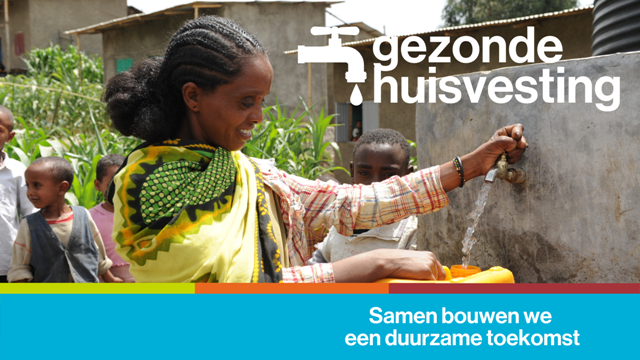
Habitat bouwt aan een duurzame toekomst – met gezonde huisvesting
Een overvolle sloppenwijk, hutjes van modder zonder ventilatie en vervuild water om te drinken… Wie zo woont, kan onmogelijk gezond blijven! Volgens De Verenigde Naties sterven er elk jaar 10 miljoen mensen door slechte leefomstandigheden.
Om de gezondheidssituatie in de wereld te verbeteren, is goede huisvesting dus de sleutel!
96
*|MC:SUBJECT|*
p{
margin:10px 0;
padding:0;
}
table{
border-collapse:collapse;
}
h1,h2,h3,h4,h5,h6{
display:block;
margin:0;
padding:0;
}
img,a img{
border:0;
height:auto;
outline:none;
text-decoration:none;
}
body,#bodyTable,#bodyCell{
height:100%;
margin:0;
padding:0;
width:100%;
}
.mcnPreviewText{
display:none !important;
}
#outlook a{
padding:0;
}
img{
-ms-interpolation-mode:bicubic;
}
table{
mso-table-lspace:0pt;
mso-table-rspace:0pt;
}
.ReadMsgBody{
width:100%;
}
.ExternalClass{
width:100%;
}
p,a,li,td,blockquote{
mso-line-height-rule:exactly;
}
a[href^=tel],a[href^=sms]{
color:inherit;
cursor:default;
text-decoration:none;
}
p,a,li,td,body,table,blockquote{
-ms-text-size-adjust:100%;
-webkit-text-size-adjust:100%;
}
.ExternalClass,.ExternalClass p,.ExternalClass td,.ExternalClass div,.ExternalClass span,.ExternalClass font{
line-height:100%;
}
a[x-apple-data-detectors]{
color:inherit !important;
text-decoration:none !important;
font-size:inherit !important;
font-family:inherit !important;
font-weight:inherit !important;
line-height:inherit !important;
}
.templateContainer{
max-width:600px !important;
}
a.mcnButton{
display:block;
}
.mcnImage,.mcnRetinaImage{
vertical-align:bottom;
}
.mcnTextContent{
word-break:break-word;
}
.mcnTextContent img{
height:auto !important;
}
.mcnDividerBlock{
table-layout:fixed !important;
}
h1{
color:#222222;
font-family:Helvetica;
font-size:40px;
font-style:normal;
font-weight:bold;
line-height:150%;
letter-spacing:normal;
text-align:center;
}
h2{
color:#222222;
font-family:Helvetica;
font-size:34px;
font-style:normal;
font-weight:bold;
line-height:150%;
letter-spacing:normal;
text-align:left;
}
h3{
color:#444444;
font-family:Helvetica;
font-size:22px;
font-style:normal;
font-weight:bold;
line-height:150%;
letter-spacing:normal;
text-align:left;
}
h4{
color:#949494;
font-family:Georgia;
font-size:20px;
font-style:italic;
font-weight:normal;
line-height:125%;
letter-spacing:normal;
text-align:left;
}
#templateHeader{
background-color:#4caad8;
background-image:none;
background-repeat:no-repeat;
background-position:50% 50%;
background-size:cover;
border-top:0;
border-bottom:0;
padding-top:0px;
padding-bottom:0px;
}
.headerContainer{
background-color:transparent;
background-image:none;
background-repeat:no-repeat;
background-position:center;
background-size:cover;
border-top:0;
border-bottom:0;
padding-top:0;
padding-bottom:0;
}
.headerContainer .mcnTextContent,.headerContainer .mcnTextContent p{
color:#757575;
font-family:Helvetica;
font-size:16px;
line-height:150%;
text-align:left;
}
.headerContainer .mcnTextContent a,.headerContainer .mcnTextContent p a{
color:#007C89;
font-weight:normal;
text-decoration:underline;
}
#templateBody{
background-color:#transparent;
background-image:none;
background-repeat:no-repeat;
background-position:center;
background-size:cover;
border-top:0;
border-bottom:0;
padding-top:27px;
padding-bottom:54px;
}
.bodyContainer{
background-color:transparent;
background-image:none;
background-repeat:no-repeat;
background-position:center;
background-size:cover;
border-top:0;
border-bottom:0;
padding-top:0;
padding-bottom:0;
}
.bodyContainer .mcnTextContent,.bodyContainer .mcnTextContent p{
color:#757575;
font-family:Helvetica;
font-size:16px;
line-height:150%;
text-align:left;
}
.bodyContainer .mcnTextContent a,.bodyContainer .mcnTextContent p a{
color:#007C89;
font-weight:normal;
text-decoration:underline;
}
#templateFooter{
background-color:#00afd7;
background-image:none;
background-repeat:no-repeat;
background-position:center;
background-size:cover;
border-top:0;
border-bottom:0;
padding-top:0px;
padding-bottom:0px;
}
.footerContainer{
background-color:#transparent;
background-image:none;
background-repeat:no-repeat;
background-position:center;
background-size:cover;
border-top:0;
border-bottom:0;
padding-top:0;
padding-bottom:0;
}
.footerContainer .mcnTextContent,.footerContainer .mcnTextContent p{
color:#FFFFFF;
font-family:Helvetica;
font-size:12px;
line-height:150%;
text-align:center;
}
.footerContainer .mcnTextContent a,.footerContainer .mcnTextContent p a{
color:#FFFFFF;
font-weight:normal;
text-decoration:underline;
}
@media only screen and (min-width:768px){
.templateContainer{
width:600px !important;
}
} @media only screen and (max-width: 480px){
body,table,td,p,a,li,blockquote{
-webkit-text-size-adjust:none !important;
}
} @media only screen and (max-width: 480px){
body{
width:100% !important;
min-width:100% !important;
}
} @media only screen and (max-width: 480px){
.mcnRetinaImage{
max-width:100% !important;
}
} @media only screen and (max-width: 480px){
.mcnImage{
width:100% !important;
}
} @media only screen and (max-width: 480px){
.mcnCartContainer,.mcnCaptionTopContent,.mcnRecContentContainer,.mcnCaptionBottomContent,.mcnTextContentContainer,.mcnBoxedTextContentContainer,.mcnImageGroupContentContainer,.mcnCaptionLeftTextContentContainer,.mcnCaptionRightTextContentContainer,.mcnCaptionLeftImageContentContainer,.mcnCaptionRightImageContentContainer,.mcnImageCardLeftTextContentContainer,.mcnImageCardRightTextContentContainer,.mcnImageCardLeftImageContentContainer,.mcnImageCardRightImageContentContainer{
max-width:100% !important;
width:100% !important;
}
} @media only screen and (max-width: 480px){
.mcnBoxedTextContentContainer{
min-width:100% !important;
}
} @media only screen and (max-width: 480px){
.mcnImageGroupContent{
padding:9px !important;
}
} @media only screen and (max-width: 480px){
.mcnCaptionLeftContentOuter .mcnTextContent,.mcnCaptionRightContentOuter .mcnTextContent{
padding-top:9px !important;
}
} @media only screen and (max-width: 480px){
.mcnImageCardTopImageContent,.mcnCaptionBottomContent:last-child .mcnCaptionBottomImageContent,.mcnCaptionBlockInner .mcnCaptionTopContent:last-child .mcnTextContent{
padding-top:18px !important;
}
} @media only screen and (max-width: 480px){
.mcnImageCardBottomImageContent{
padding-bottom:9px !important;
}
} @media only screen and (max-width: 480px){
.mcnImageGroupBlockInner{
padding-top:0 !important;
padding-bottom:0 !important;
}
} @media only screen and (max-width: 480px){
.mcnImageGroupBlockOuter{
padding-top:9px !important;
padding-bottom:9px !important;
}
} @media only screen and (max-width: 480px){
.mcnTextContent,.mcnBoxedTextContentColumn{
padding-right:18px !important;
padding-left:18px !important;
}
} @media only screen and (max-width: 480px){
.mcnImageCardLeftImageContent,.mcnImageCardRightImageContent{
padding-right:18px !important;
padding-bottom:0 !important;
padding-left:18px !important;
}
} @media only screen and (max-width: 480px){
.mcpreview-image-uploader{
display:none !important;
width:100% !important;
}
} @media only screen and (max-width: 480px){
h1{
font-size:30px !important;
line-height:125% !important;
}
} @media only screen and (max-width: 480px){
h2{
font-size:26px !important;
line-height:125% !important;
}
} @media only screen and (max-width: 480px){
h3{
font-size:20px !important;
line-height:150% !important;
}
} @media only screen and (max-width: 480px){
h4{
font-size:18px !important;
line-height:150% !important;
}
} @media only screen and (max-width: 480px){
.mcnBoxedTextContentContainer .mcnTextContent,.mcnBoxedTextContentContainer .mcnTextContent p{
font-size:14px !important;
line-height:150% !important;
}
} @media only screen and (max-width: 480px){
.headerContainer .mcnTextContent,.headerContainer .mcnTextContent p{
font-size:16px !important;
line-height:150% !important;
}
} @media only screen and (max-width: 480px){
.bodyContainer .mcnTextContent,.bodyContainer .mcnTextContent p{
font-size:16px !important;
line-height:150% !important;
}
} @media only screen and (max-width: 480px){
.footerContainer .mcnTextContent,.footerContainer .mcnTextContent p{
font-size:14px !important;
line-height:150% !important;
}
}
*|MC_PREVIEW_TEXT|*<!--
|